Implementing Dark Mode in your web app

Dark mode had recently become a very popular feature on the web, offering an alternative to the traditional light mode for users who prefer a darker interface.
It's not just a trend on the web, it's also a thing on operating systems: with macOS, iOS, Android and Windows all offering a dark mode.
With this in mind, there's a few reasons so consider implementing dark mode into your project:
- It improves accessibility for users with certain visual impairments, for example those with light sensitivity.
- It's a fairly common feature, so it's likely to be expected by your users. Especially those who use dark mode on their operating system.
- Improved UX by allowing the user to switch between light and dark mode at will in different lighting conditions.
- For devices with OLED screens, dark mode can improve battery life.
Designing for Dark Mode
Choose your colours
We don't put pure black text on a pure white background because it's hard to read. The same rule applies to dark mode, don't just set your background to black and your text to white.
You should choose colours that are easy to read, but still contrast well with each other.
Maintain consistency
Don't bin your brand guidelines just because you're implementing dark mode. Your site should still have a consistent look and feel, even if the colours are different.
You might keep some of the same colours, for example using your primary colour for both themes. Or you might make tweaks to your existing brand colours to make them work better in dark mode - for example changing the saturation and using slightly lighter or darker shades.
Cater for user preferences
Don't force your users to use a certain theme, let them choose.
You can automatically set a theme based on the user's operating system or time of day, but you should still allow them to override this in an obvious way.
The "traditional" theme switching option is using sun/moon icons to toggle between light and dark mode, and having this in the header or footer of your site.
CSS
Media Queries
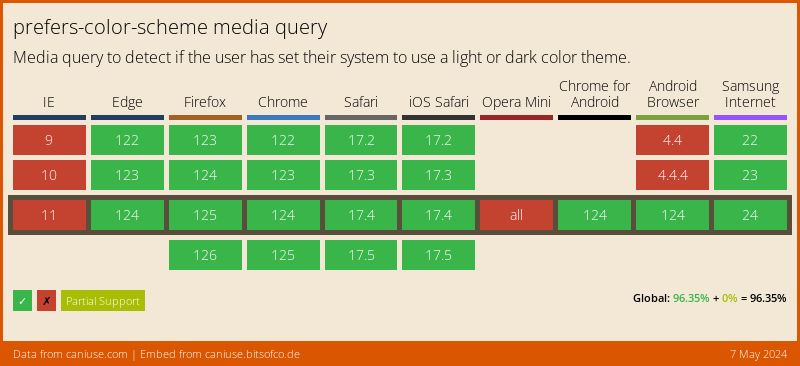
The Level 5 specification for CSS Media Queries introduced prefers-color-scheme. This allows you to detect if the user has set a light or dark theme on their operating system.
At time of writing, it has pretty good browser support, except for IE11 and Opera Mini...neither which we really care about.
Code
This code will apply the styles inside the media query if the user has set a dark theme on their operating system.
@media (prefers-color-scheme: dark) {
    body {
        background-color: #1b1b1d;
        color: #fff;
    }
}
The issue with this approach is the user can't toggle the theme easily, they can change the theme for their OS but they won't do this purely to view your site in a different theme.
You should still provide a way for them to switch between light and dark mode.
CSS Variables
CSS variables (custom properties) are another way to implement dark mode. They allow you to set a variable once, and then use it throughout your CSS.
When the user switches themes, you can change the value of theme variables.
Code
This code sets the default (light) theme colours, and then overrides if the user selects a dark theme.
/* Light colours */
:root {
    --background-color: #fff;
    --text-color: #1c1e21;
}

/* Dark colours */
html[data-theme="dark"] {
    --background-color: #1b1b1d;
    --text-color: #fff;
}

body {
    background-color: var(--background-color);
    color: var(--text-color);
}
In order to trigger the dark theme we'd need to add a data-theme attribute to the html element using JavaScript.
// Put this wherever you want to trigger the dark theme
document.documentElement.setAttribute('data-theme', 'dark');
React
Context
We can use React's Context API to pass a theme to our components.
const ThemeContext = React.createContext();

return (
    <ThemeContext.Provider value={theme}>
       <App />
    </ThemeContext.Provider>
);
Then we can use the useContext hook to access the theme in our components.
// Inside a component
const theme = useContext(ThemeContext);

return (
    <div style={{ backgroundColor: theme.background, color: theme.text }}>
       <h1>My App</h1>
    </div>
);
JSS
JSS is a CSS-in-JS library that's been my go-to for styling for a few years now. It has theming support out of the box, and we can easily swap themes on-the-fly.
// Assuming we're importing 2 themes from a separate file
const [theme, setTheme] = useState(lightTheme);

function updateTheme () {
   // Some logic to decide which theme to load
   setTheme(darkTheme);
}

return (
    <ThemeProvider theme={theme}>
       <App />
    </ThemeProvider>
);
Persisting the theme
It's not very useful if the user has to switch the theme every time they visit your site, so you'll want to persist the theme between sessions.
localStorage
We can use localStorage to persist the theme between sessions.
function updateTheme () {
   // Some logic to decide which theme to load
   setTheme(darkTheme);
   localStorage.setItem('theme', 'dark');
}
Then we can check for the theme in localStorage when the app loads.
if (localStorage.getItem('theme') === 'dark') {
    // Set the theme to dark
}
Conclusion
As web developers our job is to keep up with the latest trends and technologies. By implementing dark mode into your project, you're catering to a growing demand and helping to improve accessibility for your users.
Implementing a full dark mode colour scheme isn't easy, but it's worth it.